Fenestra User's Guide (Chapter 4) -- contents | previous | next
A large part of a user interface is made of dialog boxes, which are implemented by this cluster along with the `controls' they contain. The word control is used in this library and in Windows terminology to describe the elements of a dialog box that are used inside dialog boxes, mainly for user interaction. They are sometimes called `widgets' in other environments. Typical controls are push buttons, check boxes, list boxes, etc. Despite being generally used within dialog windows, controls can also be used independently inside other types of windows.
Before the presentation of the actual dialog and control classes, there will be an overview of the general structure of the cluster and the dynamic dialog box creation system.
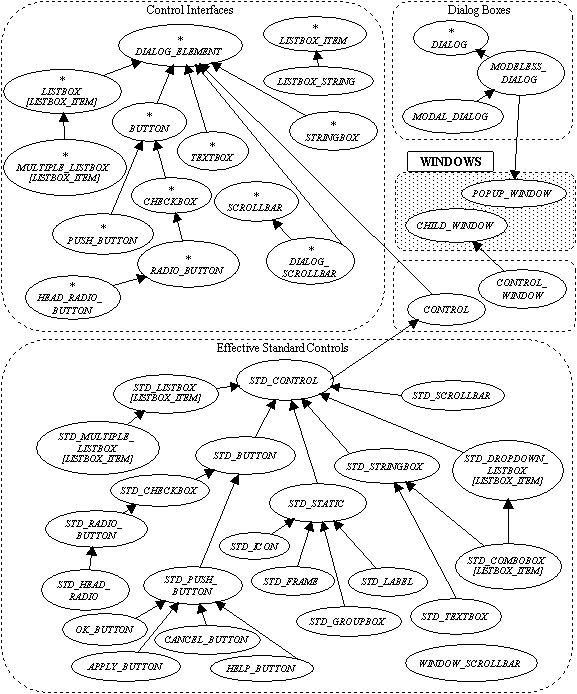
The cluster inheritance graph at the beginning of this chapter may at first look a bit strange: there are two trees of classes apparently representing similar objects associated with controls. The situation is similar for dialog boxes although it does not look as unusual as there is only a handful of classes in this case.
One of controls tree actually contains only deferred classes which are used to define the abstract interface of controls, while the other is a family of actual implementations. The implementation tree shadows the abstract tree, and there are inheritance relationships between the two, which were left out of this first graph for clarity, a diagram with the relationships between the two trees is included later in section (see section 4.6.1).
From the functionality point of view, the cluster has two basic kinds of object: dialog boxes and controls. At the abstract level, these concepts are considered independently of their implementation with (or as) windows and child windows. Abstracts dialog boxes are under the class DIALOG and the controls contained in a dialog box are descendants of DIALOG_ELEMENT. These classes are all deferred. A dialog contains and refers to its elements, and, conversely, a dialog element has an instance of DIALOG indicating the parent dialog. Nevertheless, dialog elements can also be used independently of dialog boxes.
While there is a single class for abstract dialogs, there is a hierarchy of classes inheriting from DIALOG_ELEMENT to describe the most common type of controls, for instance push buttons or list boxes. These are deferred classes too, describing the interface of the control with its clients, including relevant events.
The concrete implementation of these deferred classes will be more closely linked to the concept of window and child window from the `Windows' cluster (chapter (see section 3)). A real dialog box will be a popup window and therefore will inherit both from POPUP_WINDOW and DIALOG.
A control is generally, but not necessarily, implemented with a child window. In order to avoid namespace clutter -- CHILD_WINDOW has already one of the largest flat-short forms in the library -- controls are implemented by using a client relation with its associated child window instead of inheritance. Indeed, a control user need not use the window features directly as the interface inherited from the dialog element hierarchy provides all required facilities for using the control. A control implemented with a client child window is introduced by the class CONTROL which inherits from DIALOG_ELEMENT. A specific concrete control will inherit both from CONTROL and an interface from the DIALOG_ELEMENT hierarchy. While the client relationship with CHILD_WINDOW is preferred, the class CONTROL is flexible enough to allow optionally the use of inheritance from an heir to CHILD_WINDOW when that is judged more convenient.
A special kind of control is the standard, or built-in, control. This is a control provided and managed by the operating system, as opposed to controls implemented from scratch with the library -- the latter are viewed as normal child windows by the operating system. Controls managed by the system are in a way normal child windows, but not completely. These windows( events are managed directly by the operating system for instance. There lies an extra reason for controls not to inherit from CHILD_WINDOW.
These controls are descendants of the base class STD_CONTROL, itself an heir of CONTROL. Then concrete standard controls inherit from each other and from the dialog element hierarchy. A built-in button, STD_PUSH_BUTTON, will inherit from STD_BUTTON for its partial implementation and from PUSH_BUTTON for its public interface. The concrete hierarchy shadows the abstract one thanks to multiple inheritance.
The existence of this particular family of controls should make clear why the segregated hierarchies of concrete and abstract controls have been introduced. If for instance a custom button is introduced for a button with a picture instead of a simple text label, it cannot inherit from the standard built-in push button as it will not work like a built-in control (it will use a proper child window, etc). Nevertheless, it will have all the basic properties and events of a normal button from the client perspective. It then can inherit from CONTROL and the abstract PUSH_BUTTON.
Dialogs boxes offered by this library, are programmed as dynamic dialog boxes, which is not so common under Windows. While they look the same to the user, these dialogs are not based on dialog resources: they are created dynamically at the time of execution. There are no references to embedded resources, so there is no separate resource section to maintain (although resource strings can still be used for localisation).
There is no dialog editor nor any dialog editing to do. Dialogs are described in Eiffel and instanciated at run-time. The layout of the dialog is done by using the relative positioning features of the basic dialog element class. This has interesting applications not possible with the traditional system, such as dialogs being customised depending on the context. Other advantages were discussed in section (see section 2.3.4).
It is of course possible to specify actual coordinates for individual controls but that should not be needed most of the time. When coordinates are needed, dialog coordinates are used instead of device dependent coordinates. This system is similar to the coordinate system of Windows resource files and ensures that the dialog box will be adequately displayed whatever the display and the user system preferences. The dialog box coordinate system's units are based on the base dialog box font, which can be optionally customised but is generally provided by the operating system.
As exemplified in the tutorial (chaper (see section 1)), a dialog is an heir to MODAL_DIALOG or MODELESS_DIALOG whose when_prepared event is effected for initialisation and layout of its controls. Attributes are needed for controls whose state will have to be later retrieved, none is needed for cosmetic controls such as labels or frames.
Controls are created and positioned relatively to each other using the corresponding procedures from DIALOG_ELEMENT, for example place_under or place_right. Controls can be sized proportionally to each other. It is sometimes necessary to set the width of a control using an absolute value, depending on how much text is displayed -- the absolute width is proportional to the size of the font being used if the normal dialog font is used.
Group boxes are used to group a particular set of related controls and have some appropriate positioning methods.
Finally, the dialog procedure arrange can be used to nicely resize the box to enclose all controls. In this case, it is also possible to centre push buttons -- often found at the bottom of a dialog box -- with positioning procedures from PUSH_BUTTON.
Normal dialogs have standard push buttons like OK_BUTTON and CANCEL_BUTTON, or equivalent button which call apply and finish. More complex dialogs may have separate events associated with some controls.
Once the actual controls have been created, they may have to be initialised. As a result of user interaction, the dialog events like when_applied are triggered. During these events and at initialisation, the dialog may need to communicate with the rest of the system. There are several ways in Eiffel for several parts of a system to exchange information: the dialog can share a once value with other classes, or it can have referenced to the objects the dialog acts on. In the context of dialogs. It is also possible to use the parent attribute of windows, which can be redefined to the type of the client, if this is also a descendant of WINDOW -- or the correct type can be retrieved with an assignment attempt.
Dialogs are generally designed to be used with a mouse interface. It is nevertheless useful to also have a keyboard interface. Under the native API, a keyboard interface is implemented by the operating system for modal dialogs loaded from resources. As this library's dialog boxes are generalised to modeless dynamic dialogs, this facility cannot used and the dialog keyboard interface is implemented by the library. It is transparent to the client who need only worry about optional keyboard shortcuts. The dialog interface is implemented partly by the dialog classes and the control classes. When writing new controls, the basic dialog keyboard interface may be inherited and extended if the control has its own keyboard interface.
The class DIALOG defines an abstract dialog, basically a place holder for a set of dialog elements (class DIALOG_ELEMENT in section (see section 4.4) below). While it has a role in the relation between elements and implementation of the keyboard interface, its public interface is rather simple.
The default font that will be used by all dialog elements in the current box -- unless they specify their own font -- can be changed using set_font. This font's dimensions will also be used to define the metrics of the dialog coordinate system, for positioning controls. The library provides a default font and it is recommended to keep this default choice for consistency of the user interface with other applications.
In addition to the initialisation event, when_prepared, two other events are deferred and must be effected: when_applied is called when the dialog status is to be effected, normally when an `OK' or `Apply' button or other client code calls the procedure apply. The procedure when_finished is invoked when the window is closed, either by a system event like the user having used the close box, or when a client or a button calls the method finish, which also closes the window.
It should be noted that apply does not imply the termination of the dialog processing, so for instance a button implementing a normal `OK' button behaviour shall call apply and then finish.
These events should be used instead of redefining low-level events from classes like WINDOW because these, first, may already be used by the implementation of the concrete dialog box itself; and secondly, it leaves open other types of dialog not linked directly with an actual window.
Finally, the procedures set_ok_push_button and set_cancel_push_button are used to set the optional buttons which will be `executed' in answer to the keyboard actions corresponding to `OK' and `Cancel' (typically the Enter and Escape keys). The `OK' button will have its default status -- showing which is the current default button for the keyboard interface -- enabled unless another push button is active.
The first form of concrete dialog box is the modeless dialog. It is simply a normal popup window which stays on top of its parent but can be used concurrently with it. The class MODELESS_DIALOG inherits from the abstract DIALOG and POPUP_WINDOW and accordingly has the properties of both. In addition to these, it provides the procedure arrange which will resize the window to an optimal size so that all controls are visible.
The creation procedures are make and make_thin, which differ by creating a dialog with a thick dialog border -- the system default for dialogs -- or a thin border, sometimes recommended for modeless dialogs. Dialogs are not generally resizable and do not have the resizing facilities of standard overlapping windows.
The second type of dialog box is the modal dialog, class MODAL_DIALOG, it is like a dialog box which disables its parent window so that the user has to go through the dialog before the main processing continues. In this library, modal dialogs are actually modeless dialogs which simply disable their parent. There is no difference otherwise for the programmer, and information is passed to the parent, or any other relevant part of the system, like in the modeless case. There is no blocking method like in traditional Windows programming which would return when the modal dialog is closed -- this kind of processing is not needed in an object oriented system where answering events asynchronously is normal.
The last type of dialog box, APPLICATION_DIALOG, is a combination of the class APPLICATION and a dialog box. It inherits from both the application and dialog classes and thus allows a dialog box to be the root class of a system. Its creation procedure, which can be the root creation procedure, do not take any parameter. They are named make and make_thing like in the normal dialog case.
This section introduces the individual interfaces for dialog elements, or abstract controls. It is generally possible to use variables of these types when instanciating actual controls, the concrete type being specified in the creation instruction.
The class DIALOG_ELEMENT is the ancestor of all abstract controls. It introduces the parent dialog and the essential positioning features.
The attribute dialog is the associated parent dialog. This is not necessary a valid field, the precondition indicates that it is valid only when has_dialog_box is true. It means that a control may be used independently of dialog boxes, for example in the client area of a normal window.
The positioning features are generally used to change the position of the current control relatively to another element. These operations are conducted in dialog coordinates, which are accessible with the features indep_size and indep_set_size which mirror size and set_size in WINDOW. A few helper methods -- indep_set_point, indep_set_width and indep_set_height -- are present for changing just part of the element's coordinates, as it is often needed with controls.
While there are none in the base class, most dialog elements introduce events such as a click for a button. Apart from the case of buttons, it is usually not necessary to process them, unless the dialog is modified as a result of user interaction. The events are usually available through both event systems, (described in section (see section 2.3.1)) so that there is both a when_ procedure exported to PUBLIC_NONE and a set_command kind of procedure for associating a command object. The default implementation of the redefinable procedure is precisely to call the command object. The latter is often the most convenient for controls which have few distinct events.
The first and most common type of control is the button. Buttons are elements whose state is changed by a simple click on them (or using the keyboard equivalent). It includes push buttons, check boxes and radio buttons.
The class BUTTON is the base class for all these, and introduces the common features: the procedure set_label to change the displayed name of the button, and the event corresponding to a click or equivalent, which is called execution of the corresponding action. The event is set with set_command (it is the only event associated with buttons) or by redefining when_executed).
The class PUSH_BUTTON adds features to set and check the status of a button -- the boolean down and the procedure is_down -- although it should not be needed to access these directly in common cases.
More interestingly, it adds new positioning procedures specific to push buttons, that is centring a row of buttons at the bottom of a dialog box. Three procedures are provided, center and left_of_center and right_of_center, to respectively place the button at the centre, when there is a odd number of button, or at either side of the centre, when there is an even number of buttons. Other buttons will be positioned relatively to the centred button. The centring is done on the basis of the optimal size of the dialog box as if it was arranged with the procedure arrange from the dialog -- it means other controls, or at least the rightmost, should have been positioned before a button is centred.
The last facility is the default status. Whatever control has currently the focus, there may be a default push button which will be `executed' by pressing the `Enter' key or equivalent, as implemented by the dialog keyboard interface. When one of the push button is active it gets the default status. The default status is implemented visually with a thicker border in most cases. Only one button at a time can have the default status. The procedure set_default changes the current status, indicated by the boolean default, although this is usually handled automatically (see the discussion on the default OK and Cancel buttons in the dialog section, (see section 4.3) above).
For developers implementing their own push buttons, there are the procedures get_default and lose_default to be called when the button loses and gets the focus, to acquaint the button with the default status management system implemented by the dialog system. These procedures are exported to PUBLIC_NONE and are so reachable when inheriting from the abstract class.
A check box is control whose status can be toggled between two states. It is represented by a check mark or equivalent next to the button label. The class is unsurprisingly named CHECKBOX. The status is the boolean value is_checked and can be changed with the pair check_mark and uncheck_mark.
It also adds, in common with radio buttons, a feature adapt_width which sets the width of the button so that it contains the label text. It should be called after the label has been changed of course.
Radio buttons are similar to check boxes -- they have the same status methods -- but their aspect is changed to suggest that only one at a time may be checked in a given group. In order to ensure that this is actually the case, the library provides a system to manage the group automatically. The system is similar to the one for menu items (as described in section (see section 3.6)), that is, there are two classes: RADIO_BUTTON for ordinary buttons and HEAD_RADIO_BUTTON for the leader of a group. Each ordinary button shall be associated with a leader, using the procedure set_leader, that will thereafter ensure that only one button under its leadership is checked. The leader will be the default checked radio at the start of the dialog. Even when the status of a radio button is changed by the client (using check_mark for instance) the system will ensure that the set of buttons is in order. For added convenience, HEAD_RADIO_BUTTON has an additional attribute checked_radio_button which is a reference to the currently selected button.
The list box is a more sophisticated kind of control. It is a display of a list of items, of which the user can select one or more. It can have differing aspects on screen, as the various available concrete implementation will show.
List boxes are implemented as generic classes, the generic parameter being of the type of the items, constrained to LISTBOX_ITEM. It introduces the basic abstract item -- LISTBOX_ITEM is deferred -- which has a name to be displayed in the list box. The class has two deferred functions, name of type string and is_valid of type boolean which is true when the item is ready for inclusion.
A simple concrete type of item is provided: the class LISTBOX_STRING associates a simple string with an item. The string is changed with set_name, also known as make to be used as a creation procedure.
There are two abstract classes for the listbox dialog element, one for simple selection lists, which allow only one item to be selected, and the other for multiple selection lists.
The first one is the generic class LISTBOX. It has the common list management methods: add_item to add a single item to the list, add_list to add a complete list in one go, and remove_all to reset the existing list. The default item which will appear selected is set with select_item, which checks boolean has_item in its precondition to make sure the item is in the list -- the actual object that is in the list must be used for a reference. The item names be unique for the control to operate correctly. Other functions allow access to the current state of the control, that is mainly selected_item, a reference to the currently selected item, if there is one, that is if has_selection is true.
There are two events, also common to all list boxes. The selection event -- when_selected or set_select_command -- occurs when an item has just been selected, and the execution event -- when_executed or set_execute_command -- when further action is needed on the selected item, typically in response to the user double-clicking on the item.
The second type of lists is MULTIPLE_LISTBOX. It differs from the previous one by having an extra selected_range functions, which returns a list of references to the selected items. The single select_item still exists and return the latest item which has been added to the selection, which is also the one subject to events.
Data entry can be done using text entry dialog elements. Two types of controls are provided for that purpose: string boxes for entry of short information on a single line, and text boxes for multiple line information.
A simple editable character string is associated with the class STRINGBOX which has a feature set_contents to initialise the string, and the value contents to access it. Note that set_contents copies its parameter and does not keep a reference on it. The control has one event called whenever the string is modified, it is accessed by using set_command or redefining when_changed.
For multiple-line edition the class TEXTBOX is provided. The functionality provided by a corresponding control is similar to a simple text editor. The element has the features contents and set_contents which are similar to those in STRINGBOX but refer to a list of strings instead of a simple string. The function returns a copy of the current status of the control. There are no events as the aim is not to provide a complete customisable text editor. It should also be emphasised that TEXTBOX does not inherit from STRINGBOX.
The scrollbar is not an ordinary dialog element. Functionally, it is long rectangular box containing a smaller rectangle, or slider, that can be positioned inside its container in one direction. It is special because this element can be part of a dialog box, or built into windows. For that reason, the basic class SCROLLBAR does not inherit from DIALOG_ELEMENT -- windows' scrollbars are not dialog elements. An extra class, DIALOG_SCROLLBAR combines the abstract scrollbar with the fundamental dialog element.
A scrollbar can be horizontal or vertical and this information is given by the mutually exclusive boolean attributes is_horizontal and is_vertical.
Two variables are important to define the slider inside the bar: its size and position. They are both relative to an arbitrary range, changed with set_range and accessible through the integer range. A default value, default_range, is provided. Position and size must then be included in the (1,range) interval, and this can be checked with is_valid_range. It is possible to use real values (between 0 and 1) instead of integers, thanks to the functions ratio_to_units and units_to_ratio.
Once the range is known, the size and position of the slider can be set on a scale between one and range. The position is where the slider will be drawn in the bar, starting from top or left depending on the orientation of the bar. The size of the slider, a feature recently introduced in the operating system, is used to indicate how much of the scrolled object is seen, so it would be half of range if half of the object is seen. It is optional and indeed not always meaningful, for instance when the scrollbar is used in a dialog to set a value such as a proportion. The slider is square if the size is not changed.
The user may move the slider directly with the mouse or indirectly by using the arrow icons, or by clicking in the bar on either side of the slider. The client is informed on slider movement independently of their origin (see the discussion on events below) and therefore indirect movement are simulated using step values, which can be updated with the procedure set_page_step and set_line_step, and retrieved using the corresponding page_step and line_step. These are named in analogy with a text editor horizontal scrollbar where, if the range is the number of line in the text, click on arrows will scroll a line down or up, and clicks in the bar outside the slider will produce a scroll of a screen `page' (or slightly less). A page step value can generally be just less or equal to the slider size value when it is used.
A scrollbar needs to communicate its position to its client. As usual, it possible either to use inheritance and redefine the event procedure when_slider_moved or associate a command object with set_command. Unusually, the two are slightly different. The event when_slider_moved receives the required position as a parameter. This is the new position where the slider should be placed using set_slider_position. A new effective version of when_slider_moved should do that too but can decide otherwise if the client has particular requirements. The default implementation of the event procedure changes the position before executing the associated command, which is then more of a notification of the change, to let the application update the display for example.
Events are not only generated after a complete move but also during the movement when the user is actually in the process of moving the slider, unless it is an indirect move which always occurs in one step. It is not always recommended to update the associated content actively during the move -- required redraws may be too long for good interactive performance -- and so the client may check the tracked boolean value, which is set to true during the intermediate events of interactive slider moves.
The first concrete class is the basic class CONTROL which is the effective counterpart of the basic dialog element. Indeed, it inherits from DIALOG_ELEMENT. It assumes an implementation with a CHILD_WINDOW, and therefore has a self attribute, which is a reference to the child window used to implement the control. Normal clients need not access this in most cases. As explained earlier (section (see section 4)), CONTROL is using an attribute instead of inheritance for greater flexibility and avoiding name space overloading.
Apart from effecting DIALOG_ELEMENT's features, it also implements the dialog keyboard interface, in conjunction with the associated DIALOG if there is one. This, like self, is not an issue for clients, but only when writing controls, as detailed below.
The last interesting feature for general use may be the procedure set_font which changes the font used by an individual control. Normally, a control uses the default control provided by the dialog box for use by all its controls, and this function may only be useful when individual font choices are required.
The other features of the class CONTROL are useful to the writer of controls based on a child window. Most of these feature are designed for use by descendants and are exported accordingly. As it has been previously stated, there are two ways for a new control to relate with its corresponding child window: two separate classes or using multiple inheritance.
It is thus possible to have two separate classes, one inheriting from CHILD_WINDOW and the other inheriting from CONTROL. The control will create and initialise the child, and set self to be a reference to it, during its own initialisation phase.
To simplify this case, the library provides a skeleton CONTROL_WINDOW which is an heir to CHILD_WINDOW and implements the basic dialog keyboard interface for a new control, by redefining when_key_pressed and when_character_entered. If the control has its own keyboard interface, as it is likely, it can still redefine these events and forward unprocessed key strokes to the synonym procedures, control_when_key_pressed and control_when_character_entered. The other facility in CONTROL_WINDOW is a simple reference to the associated control and an access procedure set_control which can be called during the child window's initialisation so that it can communicate with its parent control. Indeed, the keyboard interface uses the control attribute to forward its keyboard events. An invariant ensures that control is not Void after creation, so set_control ought to be called by the descendant's creation procedure, which is also likely to need to call one of child window's creation procedures.
On the CONTROL front, the descendant has to create self or set the reference, and then it should call register which does internal control initialisation such as acquainting the control to its parent dialog if relevant.
The alternative is to use multiple inheritance of both CONTROL and CHILD_WINDOW, in addition to a possible ancestor from the dialog element hierarchy. It has the benefits of keeping all the code in one class, but this can be a drawback for a large complex class as it will result in a large public interface and name space overloading -- for instance the window hierarchy includes its own register and set_text procedures so renaming is necessary.
The class CONTROL also takes care of the dialog_box attribute, which is initialised by register which does an assignment attempt on the associated child window's own parent (a WINDOW) to see if it also is a DIALOG.
In both case, there is a set of features exported to PUBLIC_NONE for use in new controls. The procedure register has already been covered above.
A few procedure relate to default metrics: default_weight and default_height are integer functions providing a default size for the control (using independent dialog coordinates), which can be set directly with the procedure default_size. The other size function, default_interspace is the measure of the space normally separating two controls.
The other features are relative to the implementation of the dialog keyboard interface. The hotkey associated with a control is changed with set_hotkey, or by using set_text which searches for the first character preceded by `&' and sets the hotkey, before setting the text string (unchanged) in the associated child window (self). The value of the hotkey is maintained in the attribute hotkey. It is the responsibility of the control implementation to display the hotkey information, for instance by underlining the corresponding character.
Two boolean functions, arrowstop and tabstop are used to inform the dialog box if the focus should be passed to this control when tab or arrow events occur. These functions are behaving like constants in CONTROL, but are not actual Eiffel constants so that they can be redefined in descendants. Note that these values are exported to DIALOG and should remain visible when redefining.
The remaining procedures are pseudo-events and provide implementations for the default dialog keyboard interface actions, that is when_hotkey (Alt+key), when_tab, when_shift_tab, when_down, when_up, when_enter and when_escape. They are to be called by the implementation during the processing of its own keyboard events -- that is precisely what the keyboard event handlers do in CONTROL_WINDOW -- or may be redefined when a control needs to get back one of the events (for instance a text editor control needs to redefine when_enter).
Most actual controls provided in this cluster are built-in controls implemented by the operating system and are introduced here. There will not be a review of their complete functionality which is defined by their abstract ancestors, but a description of their particularities, notably the creation procedures absent from the abstract classes.
The inheritance diagram below is an alternative view of the standard control hierarchy which illustrates the inheritance relations with the abstract dialog elements, which had been left out of the main diagram at the beginning of this chapter for clarity.
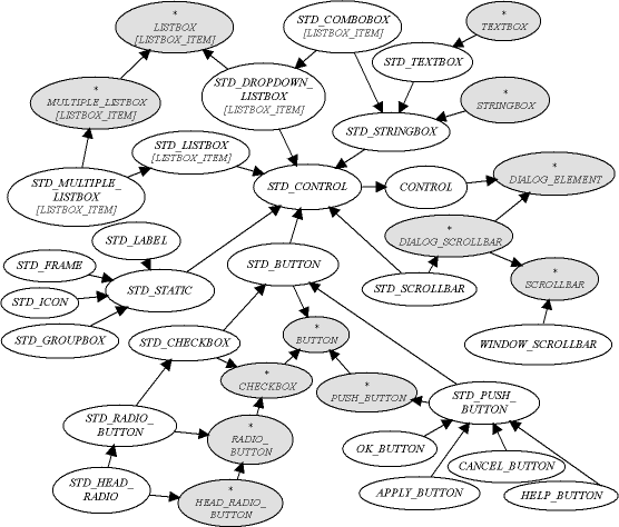
The common ancestor class for the standard control hierarchy is STD_CONTROL, a descendant of CONTROL. It does not include any new feature, it serves as a parent for all standard, or built-in, controls, whose implementation classes are generally prefixed with STD_.
As the graph shows, the hierarchy closely follows and mirrors the dialog element hierarchy, with a few exceptions:
First, there is a set of static controls under STD_STATIC. These are cosmetic controls like labels and enclosing boxes who have little remarkable functionality of their own, and are mainly distinguished by their creation procedures and types, so they are simple DIALOG_ELEMENT descendants from the abstract viewpoint.
Then, there is a set of buttons -- under STD_PUSH_BUTTON -- whose events have been redefined to provide the standard buttons in a dialog box.
Finally, under LISTBOX there are two different implementation of a listbox, the ordinary list box with a scrolling list displayed, and the drop-down list box which displays only the current item and has a drop-down list of items for selection. A more special case is the combobox, a mixture of a drop-down list and an editable string, it inherits from both the LISTBOX and STRINGBOX abstract elements.
In the reference documentation, the standard classes (but STD_CONTROL) flat-short forms are shown without their features exported to PUBLIC_NONE -- unlike the other classes in the library -- in order to display a simpler public interface. Client inheritance is rarely needed for standard controls: it is meaningful only for redefining events, in which case it is generally more convenient to use commands. The events remain documented in the abstract hierarchy.
The standard buttons classes follow straightforwardly their abstract counterparts. STD_BUTTON is an implementation class which cannot be created. The concrete classes STD_CHECKBOX and STD_RADIO_BUTTON and STD_HEAD_RADIO and STD_PUSH_BUTTON all add the creation procedure make, which takes the parent window as a parameter, to their respective abstract control interface.
A set of push buttons are ready to use with dialog boxes. Their event procedures have been redefined for handling the common dialog operations: OK_BUTTON calls DIALOG's procedures apply and finish, APPLY_BUTTON only the former, and CANCEL_BUTTON the latter. Setting the label name of these buttons is still the client's task.
Static controls are cosmetic controls with which the user does not interact directly.
The most common static control is the label, implemented by the class STD_LABEL, which displays a simple string and is useful to add indications for some other controls which do not have their own label (such as list boxes) or to add extra indications in the dialog box. The positioning feature place_just_under from DIALOG_ELEMENT is notably useful to place a control just under its corresponding label -- the normal positioning feature adds some extra space between distinct controls. The label text is changed with set_label, and there are three creation procedures: make for a normal single-line left-aligned label, make_left for a left-aligned label with a long associated `label' which will be wrapped inside the label rectangle, and make_center for the same but with a centred label text.
An icon can be displayed in a dialog for information purposes (no actions can be associated with it). The class STD_ICON has a normal creation procedure, make, and a procedure to change the associated icon, set_icon. Its parameter is a a normal icon object from the `Graphics' cluster (section (see section 5.5.8)).
A frame is a simple rectangular border, whose size is the size of the control, which can be used for grouping other controls for instance. The class STD_FRAME has two creation procedures: make for a normal `black' frame (the actual colour may depend on system wide user settings) and make_grey for a `grey' rectangle.
The group box is a frame with a label. It is very often used to group other controls, such as a set of radio buttons. The class is STD_GROUP_BOX. It has a normal creation procedure make, a procedure to change the label, set_label and a couple of positioning procedures: arrange_first to position the first enclosed control optimally and arrange for resizing the frame so that the parameter, a dialog element, is inside. The latter is generally used with the last control of the group, while the controls between the first and the last are positioned relatively to the first one.
Concrete list boxes and editable text fields are described here, in addition to the combo box, a combination of both types.
The classes STD_STRINGBOX and STD_TEXTBOX implement respectively STRINGBOX and TEXTBOX and add a simple creation procedure make which takes the parent window. A text box has another creation procedure, make_wrapping for text which will be wrapped to the width of the text control, as opposed to the default case when the control has a horizontal scrollbar.
There are two implementations of the simple listbox, the class STD_LISTBOX is for the most common, displaying a list with a scrollbar and several items visible to the user. All listbox classes have two creation procedures: make is for boxes displaying items in alphabetical order of their names (the default) and make_unsorted for display in the original order of addition to the control.
The other choice is the class STD_DROPDOWN_LISTBOX which displays only the current item to the user, who can select another item through a pop-up list of other choices. The size of the control is the size of the visible editable part, but the height is set by the operating system and cannot be changed so the height is ignored using indep_set_size. The width of the popup list is the same as the control itself, and the height can be changed with set_popup_list_height.
For multiple selection lists, which obviously cannot be drop-down list boxes, there is the class STD_MULTIPLE_LISTBOX.
The last class is STD_COMBOBOX which is a combination of both: like a drop-down list box, a popup list of choices may appear, but instead of changing a read-only field, it changes an editable field, like the one in a string box. It inherits from both the abstract classes STRINGBOX and LISTBOX. It is useful for an editable field with a set of predefined choices, or a history of previous entries, for instance.
The creation procedures are like those of a list box. The size is maintained like in a drop-down list box. The `current item' concept inherited from lists is the last selected item before edition, if it occurred. Normally the usable result is the editable string retrieved with the function contents like in a string box.
In the case of scrollbars, the duality found in the abstract hierarchy is also present in the concrete implementation, there are two concrete classes: STD_SCROLLBAR is a control used inside dialogs, and WINDOW_SCROLLBAR is for built-in scrollbars of child windows. The latter has no creation procedure, because it is an attribute of and managed by the window class. The control scrollbar has two main creation procedures, make_horizontal and make_vertical for the corresponding type of bar.